Finding information about the designers and artists behind book covers isn’t always possible. I’ve done my best to track down that information. In places where that is missing, any leads would be appreciated.
The Best Book Covers of 2019
The Ash Family by Molly Dektar
Cover design and illustration by Kimberly Glyder. This is one of those covers of which I would happily buy a print and hang on my wall in the center of the living room. The shades of blue and orange contrast against each other beautifully. That stark contrast gives off the feeling of turmoil amidst the calm of the forest—imagery that aligns with life in the Ash Family commune. —Sophia LeFevre
The Confessions of Frannie Langton by Sara Collins
Cover Design by Robin Bilardello. The cover of this book is fairly simple, but the small details convey an incredible amount of emotion and tension. The dress is historical and gives a sense of buttoned up propriety, but the gripping hands tell us everything we need to know about Frannie Langton. She’s in pain, begging to cry out, but forced to hold it in. I absolutely judged this book by its cover, and I’m so glad I did. It was a fantastic historical mystery, complex and thought provoking and unforgettable. —Susie Dumond
The Dutch House by Ann Patchett
Cover Art by Noah Saterstrom. I saw Patchett speak in Chicago shortly after her new novel’s release. She said: “Book jackets are like your birthday.” A week before, you insist you don’t know what you want to a friend and say you don’t want anything, “and when that person gives you nothing, and you go to bed on your birthday hurt and bitter, it’s only your own fault.” So she fought for her version of the cover. She didn’t want a house—she wanted that to exist in the reader’s imagination—but she thought it would be wonderful to have it feature the portrait of 9-year-old protagonist Maeve, an object that is important within the novel. Her first choice for artist, Noah Saterstrom, delivered the art that would become this gorgeous, richly colored cover. —Leah Rachel von Essen
Empress of Forever by Max Gladstone
Formidable woman staring out at you from underneath a giant, horned emerald space helmet? Please tell me more. Space operas aren’t my typical genre of choice, but I’m happy Max Gladstone lured me with this one. Why? Because he writes some of the most interesting, complex, flawed, and fiercely intelligent female characters of any author out there. That includes tech mogul Vivian Liao, who gets sucked into a space quest largely because of her own hubris, and that includes the titular Empress, taking a moment out of her day in her universe-spanning empire to tear you to shreds with her eyes on this gorgeous cover. —Nicole Hill
Escaping Exodus by Nicky Drayden
Cover Design by Richard L. Aquan Cover Illustration by Courtney “Seage” Howlett Nicky Drayden’s books are trippy, transcendent experiences, and her latest is no exception. Escaping Exodus takes place in the hollowed-out body of a giant space beast in which humans, having fled Earth generations ago, now make their home. It’s a psychedelic space romp with a queer black romance at the center, and all of this is somehow portrayed perfectly with its swirling purple and green cover. The eyes of the figure at the center of those swirls display both trepidation and resolve, setting the tone for the whole novel. That cover is serving up chaos, strength, beauty, and tentacles—the latter of which plays a much larger role in the story than you’d think. —Nicole Hill
Her Royal Highness by Rachel Hawkins
Cover Design by Jessica Jenkins. Cover Art by Sara Herranz Millares. How clever, to pull the reader into the book with a cover that holds their gaze and shows them their own reflection in extremely aspirational heart-eye sunglasses. It’s so perfectly encapsulates the feeling of reading a first-person narrative about falling in love with a Scottish princess. The level of detail in the illustration—the dimples, the gorgeous hair—is intriguing and stylish but not too busy. The first book in this series by Rachel Hawkins, Prince Charming, also got a major glow-up this year with a new title and cover, and it really fits the vibe of these breezy, tropey YA romances. —Isabelle Popp
Laura Dean Keeps Breaking Up With Me by Mariko Tamaki and Rosemary Valero-O’Connell
Cover Art by Rosemary Valero-O’Connell I knew I needed to read this book the moment I saw the cover, before I even knew what it was about. The aesthetic was that strong. The art style is clean and eye-catching, and it alludes to the novel’s theme of realizing your first love is toxic so well. Also, look at all those shades of pink! It’s not only one of the best covers I’ve seen in 2019 but possibly one of my all-time favorite YA covers. —Andy Winder
Long Live the Tribe of Fatherless Girls by T Kira Madden
Cover Design by Tree Abraham. Madden fills her memoir with nostalgia, evoking all the warm and fuzzies for Moon Shoes, jelly sandals, Sour Straws, and other joys of the ’90s/’00s. The blue-to-pink fade on the cover, complete with foiled sparkles, embodies the feeling of looking back and reminiscing about childhood. But for Madden, her childhood was complicated, and the whimsical cover stands in stark contrast to the harsh realities of her early life. —Kendra Winchester
Love From A To Z by S. K. Ali
Art Directed by Lucy Ruth Cummings Photography by Meredith Jenks It’s so rare to get book covers like this. It features two Muslim teens of colour, with one of them being a hijabi. Plus, the colour blue adorning the cover and the models is absolutely stunning. —Adiba Jaigirdar
The Many Colors of Harpreet Singh by Supriya Kalkar, illustrated by Alea Marley
Cover Illustrated by Alea Marley I was so happy to see a book celebrating Sikh culture and religion on the cover. This children’s book showcases a beautifully colored illustration of a young Sikh boy wearing the traditional turban, or patka. Sikh people have unfairly suffered from our current racist society, so I’m happy to see a book celebrating their kindness and charisma. This book is relatable to anyone who has had to move and make new friends. Supriya Kalkar expresses her protagonist’s joys and fears through colors of the season and his environment. I would love to see more books like this, celebrating the many cultures of people of color. —Shireen Hakim
Medieval Bodies by Jack Hartnell
Cover Design by Peter Dyer. I found this in a book fair. It was the only copy in show and it caught my eye instantly. It is printed in a silky paperback, with lots of different textures and gold foiling. Plus it is an amazing piece that incorporates both amazing graphic design and medieval art work. —Giovanna Centeno
Mostly Dead Things by Kristen Arnett
Cover Design by Jakob Vala Cover Illustration by John James Audubon I debated between this cover and a ton of other big images of animals on adult book covers (Bunny by Mona Awad, Rabbits for Food by Binnie Kirshenbaum, Gingerbread by Helen Oyeyemi, and several others) but ultimately, Arnett’s cover just stands out a tiny bit more. Why? Maybe it’s the fact it’s a flamingo. Maybe it’s the fact it’s a shock of chartreuse against the pink bird. Maybe it’s also the combination of the cover and knowledge it’s a book with a prominent taxidermy shop in Florida. It’s simple and beautifully memorable for that. This is an actual plate from Audubon’s work, repurposed for a book cover. —Kelly Jensen
Muslim Girls Rise: Inspirational Champions of Our Time by Saira Mir, illustrated by Aaliya Jaleel
Cover Illustrated by Aaliya Jaleel This book has the most uplifting cover of any book I’ve seen. Beautiful, lifelike illustrations showcase empowered Muslim women of our time, that are making a significant difference. Sheroes like Ilham Omar and Ibihaj Muhammad are celebrated on the cover, and the illustrations only get better and brighter throughout the book. Not only is it exciting to see faces I recognize from community events, but it is confidence-boosting to see women of color and women with head covers. —Shireen Hakim
Natalie Tan’s Book of Luck and Fortune by Roselle Lim
Cover Art and Design by Vikki Chu This is another book that drew me in through its lovely cover and kept me there with its story. The colors in the title and illustrations complement each other perfectly, and its atmosphere reflects the novel’s passion for cooking and community well. After the unexpected death of a mother she hadn’t spoken to in seven years, Natalie returns to her childhood home in San Francisco’s Chinatown. She’s shocked to discover that she has inherited the family restaurant and, after an encounter with a local seer, uses it to help her neighbors. —Andy Winder
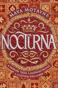
Nocturna by Maya Motayne
Cover Design by Aurora Parlagreco and Jenna Stempel-Lobell Cover Art by Mark van Leeuwen I was perusing through the historic City Lights Bookstore in San Francisco this summer and Motayne’s novel just stood out to me with its monochromatic cover. The mosaic design with varying shades of red and orange synchronize to create something that looks like a doorway into a magical world. The cover doesn’t give away much about the book, which makes sense since one of the characters wears mystery like an accessory. —Neha Patel
The Opposite of Always by Justin A. Reynolds
Cover Design by Erin Fitzsimmons Cover Art by Stephanie Singleton While I’m sure not many would call this flashy, I love it for that reason. Not only are there PoCs on it, but on each level of the staircase you can see snippets of Jake and Kate’s story through all the different cycles, even the one where they’re apart. It is something you don’t really notice until you’ve read it, and that is genius. —PN Hinton
Permanent Record by Mary H.K. Choi
Cover Illustrated by gg Cover Designed by Lizzy Bromley This dynamic cover is two-for-the-price-of-one. With the hardcover release, readers got to enjoy a transparent dust jacket that is designed to look like the main character, Pablo, and his love interest, Leanna, in an almost-kiss. Readers who remove the dust jacket, however, see how the Leanna from before is really an oversized poster on the street which a smaller Pablo, illustrated on the cover, is about to pass. The symbolism, particularly as it relates to the themes of the book, is equally genius and stunning. —Abby Hargreaves
The Revolution of Birdie Randolph by Brandy Colbert
Cover Design by Marcie Lawrence. Cover Illustration by Erin Robinson. 2019 might go down as the year that denim jackets came back for teens…at least when it comes to teens on YA book covers. As awesome as they were to see this year, it was this cover that really stands out. The bright yellow background contrasts with the jacket and Birdie’s amazing hair, and all of the pieces of this cover smartly contrast grittiness and sweetness, just like Colbert’s book does. —Kelly Jensen
The Seamstress by Allison Pittman
Cover Designed by Jen Phelps I just don’t get tired of looking at this cover! The Seamstress tells the story of the seamstress from A Tale of Two Cities. It takes a minor character and breathes life into her. What I love about the cover is that it seems so simple, but there is so much there: the woman’s profile, the French flag acting as shawl, the gorgeous calligraphy that becomes a skirt, the needle and thread tucked behind her shoulder. —Jesse Doogan
The Starless Sea by Erin Morgenstern
UK Waterstones Exclusive Edition Designed by Suzanne Dean This is one of my most anticipated books of the year, and it’s now one of the most beautiful books in my collection. The gold bee glistens on the swirling blue marbling of the cover; under the dust jacket, a gold bee, sword, and key (three symbols important to Morgenstern’s story) shine embossed on a turquoise cover. A breathtaking design worthy of one of the biggest fantasy releases this year: romantic and evocative of old books. —Leah Rachel von Essen
Technically, You Started It by Lana Wood Johnson
This cover is without a doubt among my fav of the year. The color palette, the sweet drawing style, the multitude of tiny hints about what’s to come in this sweet YA romcom. The book is told entirely in text messages, making the nearly graphic novel effect of the cover even more suitable—making it appeal to just the sorts of people who enjoy reading books with a strong visual style. —Ann Foster
The Ten Thousand Doors of January by Alix E. Harrow
Cover Design by Lisa Marie Pompilio This is a book about Doors between worlds, in which the key to those doors may be the protagonist herself, January; it is fitting for the cover to be a lock surrounded by keys. It’s also visually arresting. The bright flowers and gold lock and keys draw the eye and make you want to open that Door—and go through it into the book. —Annika Barranti Klein
Trust Exercise by Susan Choi
Cover Designed by Nicolette Seeback I love the bold colors on this cover. The repeated pattern of folding chairs is a clever nod to where the story begins: in a performing arts high school where Sarah, David, and their fellow theater students are in the thrall of their drama teacher, Mr. Kingsley. One of their key acting exercises involves sitting in chairs staring at each other, but the chairs on this cover all face in different directions. Perfect for a novel in which three linked narratives undermine and rearrange one another. The text is almost subsumed by the art (notice how the arm of one chair goes right through the “r” in the word “Exercise”), like it’s struggling to stand apart. This novel is full of questions and grey areas, but the cover is shockingly, gleefully in-your-face. —Kathleen Keenan
An Unconditional Freedom by Alyssa Cole
Cover Design by Kris Noble. The first two Loyal League covers blew me away, with their beautiful depictions of the amazing Black women who would be the core of the story. This time, though, the heroine isn’t featured, which isn’t a rare thing in historical romance. What is rare, though, is the gorgeous dark-skinned man featured alone (and properly dressed!), the pain of his past clear on his face. He’s captivating to look at, and any reader who picks him up knows they’re in for a hell of a story. —Jessica Pryde
The Water Dancer by Ta-Nehisi Coates
Cover Illustrated by Calida Garcia Rawles This cover is so evocative, and even the little details—like the waves lapping over the title and author—are part of its art. The way the cover came about is unique too. Ta-Nehisi Coates asked artist Calida Garcia Rawles if she’d be interested in painting the cover for his book after visiting her studio. She agreed, and so we have this gorgeous cover. —Margaret Kingsbury
We Set The Dark On Fire by Tehlor Kay Mejia
Cover Design by Molly Fehr. Cover Illustrated by Cristina Pagnoncelli. I have a weakness for typographic covers, and I’m absolutely obsessed with the effect of the papel picado design of We Set The Dark On Fire. The shifting gradient overlaid on a black background makes every tiny detail of the cutouts stand out, letting the title and the design speak for itself. Simultaneously subtle and stunning. —Rachel Brittain
The Wedding Party by Jasmine Guillory
Cover Design and Illustration by Vikki Chen I’m always a fan of purple-hued covers, so this book cover immediately drew me in! Since I also got married this past summer, I grew interested in reading books with wedding scenarios as a focal point! —Cathleen Perez Brenycz
Wilder Girls by Rory Power
Designed and Illustrated by Regina Flath and Aykut Aydogdu. I’m not sure I’ve ever seen a cover more perfectly matched for a book. Both are beautiful, unforgettable, and undeniably creepy—in the best way. The way the face is sliced, slowly unraveling to reveal the flora underneath, is just a perfect representation—both literally and figuratively—for everything that happens to the students at the Raxter School for Girls. —Rachel Brittain


