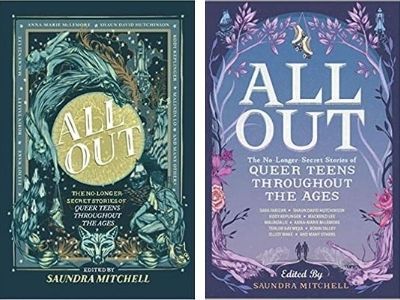
All Out: The No-Longer-Secret Stories of Queer Teens Throughout the Ages edited by Saundra Mitchell
I was already so on board with the cover of this anthology—I love the color scheme and the details in the illustrations! But when I saw the paperback cover, I admit that I gasped a bit. I love the purple tones, and even though the covers are very similar in the way they both boast a detailed illustrated framed, the paperback is a little simpler but also, a bit more fairytale like. But if you enjoy the hardcover or already own it, don’t worry—the companion anthology Out Now: Queer We Go Again! just came out in hardcover and the cover is in the style of the hardcover edition! Maybe the paperback will match this paperback edition…
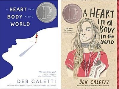
A Heart in a Body in the World by Deb Caletti
Okay, I gotta admit I was never super into the hardcover art. I appreciated what the image was going for, but the feature-less (and hairless?) figure just seemed weird to me. I was thrilled when this Printz Honor–winning book got a paperback makeover in the style of the realistic illustration trend that’s really popular right now. I think it’s pretty and it hints at what the book is about in a really nice way.
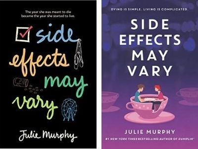
Side Effects May Vary by Julie Murphy
This is actually Julie Murphy’s debut novel, which I think has a great original cover, but it was updated recently to match the style and the title treatment of her mega-popular Dumplin‘ books! I like both a lot, but I can see how readers might leap at a chance to pick up this new cover edition, so it will match other books by Julie on the shelf. I enjoy the colors, and the whimsy of the spinning teacup ride!
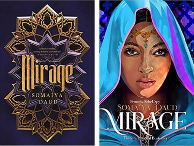
Mirage by Somaiya Daud
Mirage got a gorgeous new cover facelift, which matches the hardcover edition of the sequel, Court of Lions out now! I’m really torn about which one I like more—I admire both the artistic design of the hardcover and the illustration of the paperback, but the colors of the paperback are what swayed me!
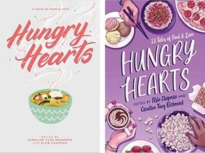
Hungry Hearts Edited by Elsie Chapman and Caroline T. Richmond
This is another “gah, how do I choose?!” situation! I really love the title treatment of the hardcover, but the paperback is sooo fun! I love the different varieties of dishes portrayed, and how you can tell that multiple people have gathered to share the food—which is what this anthology of interlinked short stories about food is all about!
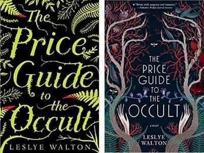
The Price Guide to the Occult by Leslye Walton
I honestly didn’t think that any paperback update could top the original hardcover beauty of The Price Guide to the Occult, but I am happy to be proven wrong! What this photo fails to convey is that the hardcover is naked (no dust jacket) and it has red sprayed edges. But this paperback is mighty fine, too! I love the colors and details, and how both covers convey the woodsy magical island setting. Take it from me, this book is so good that you’ll feel good about having both editions on your shelves.
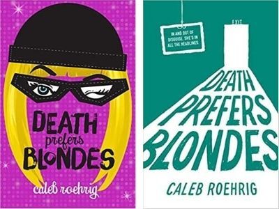
Death Prefers Blondes by Caleb Roehrig
These are two very different covers that both convey different but essential aspects of this book, which I think is fun! I love that you get the cat burglar feel of the hardcover, and I really enjoy that bright fuchsia background. The paperback might be a little bit more understated, but I enjoy the perspective, the way the title treatment falls in the light of the open door, and that exit sign! Both hint at the heist and mystery nature of the book, but I think I have to admit I prefer the hardcover version.
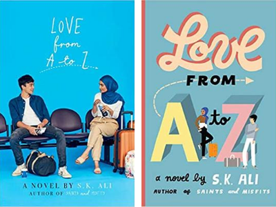
Love From A to Z by S.K. Ali
This is a fun book to compare covers with because again, they both convey similar vibes. With both you get a feel for romance, you get a sense of the characters, and you also understand that these teens are traveling—but one is photorealistic and one is illustrated! I don’t know which one I prefer, but I know that this book is a delight and you can’t go wrong by picking up either edition!
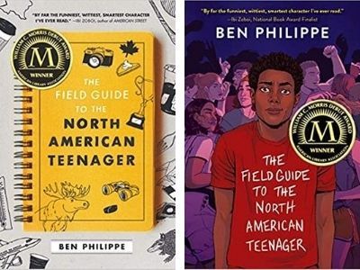
The Field Guide to the North American Teenager by Ben Philippe
I love this hardcover edition so much because I think that it’s very clever and it plays up the title so nicely. However, given the trend of covers in YA right now, I totally understand why the publisher chose to give it a little facelift for the paperback, especially as it’s a Morris Award winner! I like how awkward the guy on the cover looks, and the teens partying in the background is such a great touch!
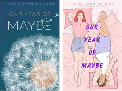
Our Year of Maybe by Rachel Lynn Solomon
This paperback cover makeover is a bit of a swerve from the hardcover, but I think that’s cool! Honestly, the hardcover was giving me more angsty and sad vibes because of the blue background and the focus on the dandelion fluff—so impermanent! With the paperback, I think you get the sense of angst in a subtler fashion (see how the girl is reaching out to the guy and he doesn’t seem to notice?) but the feel is a bit lighter and more playful. My only critique? I feel like the title just doesn’t match the rest of the cover!
See No Color by Shannon Gibney
Again, I’m noticing the trend of switching up from photorealistic for the hardcover to a more illustrated look for the paperback. I really do like the way the torn baseball is used to look like a cap on the hardcover, but I think overall the paperback makeover is much more eye-catching and cohesive. I also love the girl’s stance and how she’s holding the bat—I feel like you get a sense of her character and she’s definitely someone I want to read about.
Neverworld Wake by Marisha Pessl
This was an instance where I already owned the hardcover, but then I saw the paperback and I kinda wanted them both! I think both covers are dreamy and maybe slightly foreboding, but in different veins. I love the font and the way the girl’s face seems to be a part of the landscape in the hardcover, but I am so into the colors and how the teal and pink blend in the paperback, the house in the mist, and the shadows of the five teens which aren’t immediately noticeable. How does one choose?!
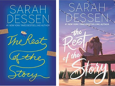
The Rest of the Story by Sarah Dessen
This book is the first novel with Sarah Dessen’s new publisher, and I think it’s interesting to see that the paperback sort of returns to the style of covers that she’s known for with her first publisher. I really like how they brought the dock and the sailboat out in each of the books, but I love the colors of the sunset in paperback, which definitely looks more romantic.
You’d Be Mine by Erin Hahn
Both of these covers are great, but I like that the paperback gives you a better feel about what the book is about, which is two teenage country superstars who must go on tour together over the course of a summer. I also love the colors in the paperback edition, and the subtle hints at country music with the girl’s boots.
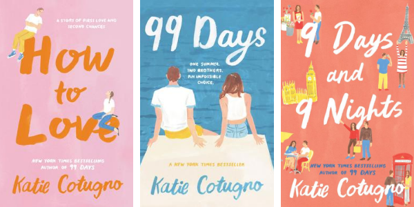
Katie Cotugno’s Backlist
Katie Cotugno’s entire backlist got a fun update! I love it when an author you love gets all new matching covers because they look gorgeous all together! And these books are a nice refresh because they now match the cover of her newest book, You Say It First! The pretty colors and the simple illustrations just make me happy! There you have it! If these paperback makeovers don’t make you want to go out and buy all the books, I don’t know what will!
